Figma Code Connect
Code Connect is a bridge between your codebase and Figma’s Dev Mode, connecting components in your repositories directly to components in your design files. We use Code Connect to generate recommended code snippets for our Figma components to improve the developer experience when translating designs to code.
How to set up Code Connect
First, you’ll need to install the Code Connect command line tool via npm:
npm install --global @figma/code-connect@latest
Second, you’ll either need to add your Figma personal access token to your terminal environment:
export FIGMA_ACCESS_TOKEN='your-generated-access-token'
You could also add your personal access token via .bashrc, .zshrc, or other appropriate file based on your shell environment.
How to use Code Connect
Finding a Figma component to generate the initial Code Connect file
After installing and setting your FIGMA_ACCESS_TOKEN in your terminal, you will need to navigate to our Figma library to find a component that needs a Code Connect config file.
You can find a potential component through various ways:
Searching through the open dependent bugs on Bug 1955395 - [meta] Figma Code Connect.
Checking the “Explore component behavior” in Figma and seeing if there no code snippet at the bottom of the “Component playground” window, underneath the “Variable modes” section.
Note: Not all Figma components will need a Code Connect config.
For example, the “Radio Button” exists as a standalone Figma component, but it is only used as a subcomponent for the “Radio Button with label,” which more accurately models our moz-label web component.
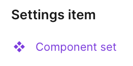
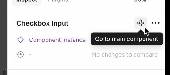
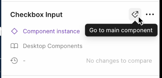
Once you are aware of the Figma component you want to work on, you’ll need to navigate to Figma and find the base Figma component. It should have an icon of a diamond made of four smaller diamonds. When you select this component, it likely will say Component set in the sidebar.
Ensure that you have selected the main Figma component instead of an instance of it. Code Connect will not setup correctly for an instance. There should be an option indicated by either a diamond with four smaller diamonds or a diamond with an arrow pointing out from the diamond. This icon button is used to go to the main component, and will be labelled “Go to main component” once you hover on the icon button. Use this “Go to main component” button to check if there is a component set higher up in the hierarchy. Once you’ve got the main component set, then you can copy a link to the component and move to generating the Code Connect config in your terminal.
Generating the initial Code Connect file for a Figma component
After finding the main component set in the previous step and copying the link to the main component, navigate to your Firefox repo in your terminal and then navigate to toolkit/content/widgets.
To simplify development, we will create the initial config file in toolkit/content/widgets by running the following command (please note the single quotes are needed to correctly parse the URL!):
npx figma connect create '<main component set link>'
For example, this command would look something like npx figma connect create 'https://www.figma.com/design/[...]?node-id=1-255' where the full URL is the GUID for your design document.
This command will work regardless if you copied the link in Dev Mode (which has an additional query &m=dev at the end of the link) or not.
If the Code Connect tool was able to find a component in that copied URL, you will receive the following output in your terminal:
Fetching component information from Figma...
Parsing response
Generating Code Connect files...
Code Connect files generated successfully:
<firefox-repo-path>\<component-name>.figma.ts
If the Code Connect tool was not able to find a component, it will throw an error and notify you in your terminal output. The most common reason for this error is the particular node or layer you used for the linked URL is not actually a component but a wrapper for one or more components. Try navigating a layer above or below the node you used and see if you are able to generate a Code Connect config file using one of those other nodes.
Modifying the generated config file
While generating the file is a good start, you will need to move it, rename it, and modify it.
You should move this generated file to the component specific folder and rename it to <component-name>.figma.ts.
The generator names the file according to the Figma component, so this may not have the same name as the Lit component.
For example, the generator creates a file titled checkbox.figma.ts.
This file should be moved to the corresponding folder - in this case /toolkit/content/widgets/moz-checkbox - and renamed to moz-checkbox.figma.ts.
The goal of this config is to create a mapping between what properties the Lit component takes and what properties are defined in Figma, which are reflected in the props object.
The values within the props object will be used in generating the Code Connect snippet.
{
  props: {
    showIcon: figma.boolean("Show icon", {
      true: "chrome://example.svg",
      false: undefined,
    }),
    label: figma.string("Label"),
  },
  example: props => html`
    <moz-badge
      label=${props.label}
      iconsrc=${props.showIcon}
      title="This appears as a tooltip on hover"
    ></moz-badge>
  `,
}
Note: The generated props object may not capture all of the properties that can or should be mapped from Figma.
When the property types match
The value of the figma[type](propertyName) “code” will be the expected value from a given instance of a Figma component.
So if it is the “checked” boolean in Figma, that value will be set to true when the instance in Figma has it set to true.
checked: figma.boolean("Checked")
When the property types are different
You can work around a type difference by providing an object to the figma[type] call, this will be used to match the value that the Figma property is set to and map it to a value for the Lit property.
// Figma State=IsChecked will set checked:true
checked: figma.Enum("State", {
  IsChecked: true,
}),
// Figma "Show icon"=true will set iconSrc:"chrome://example.svg"
iconSrc: figma.boolean("Show icon", {
  true: "chrome://example.svg",
  false: undefined,
}),
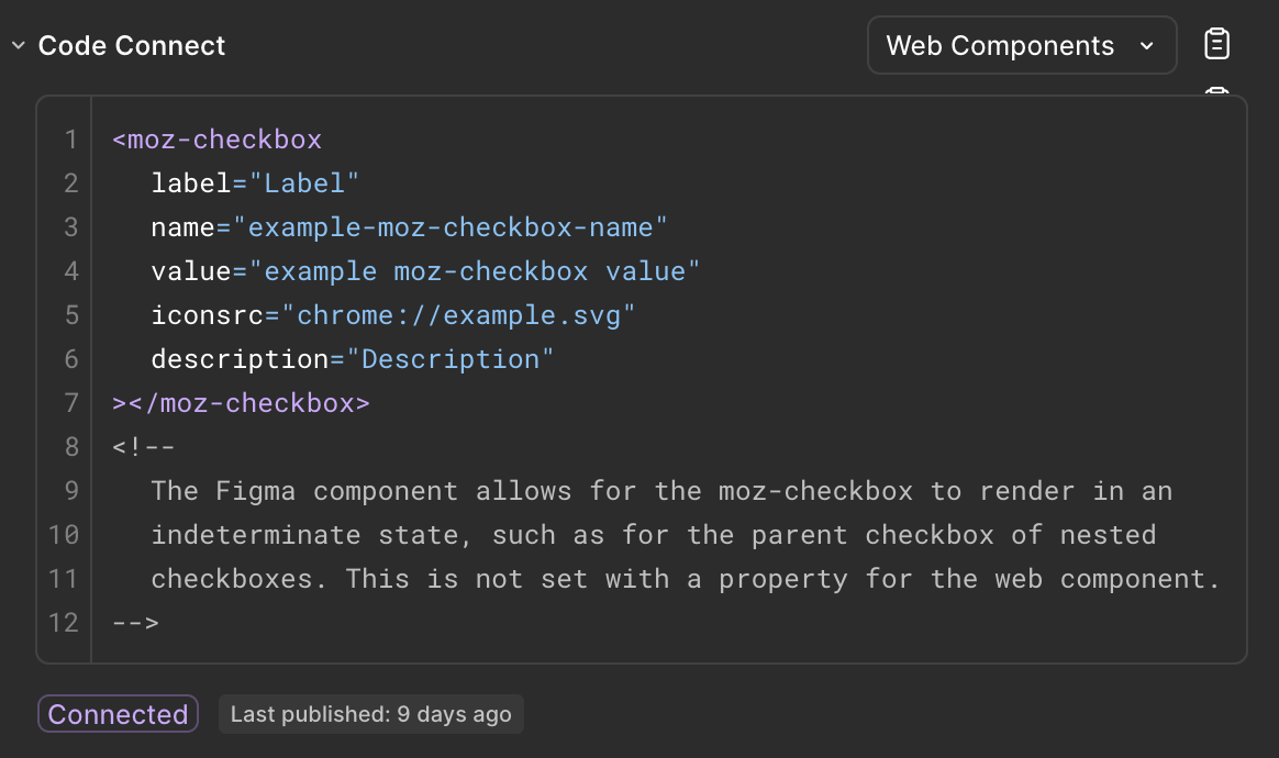
For example, we need to work around the Figma “State” enumeration to ensure that moz-checkbox is disabled correctly in the generated code snippet:
// Figma State=Disabled will set disabled:true on the generated code snippet
disabled: figma.enum("State", { Disabled: true })
// ...
html`
  <moz-checkbox
    disabled=${props.disabled}
  ></moz-checkbox>
`
Creating the example template
This example template will become the code snippet that is shown in Figma.
It will basically be the same as the Lit code but without the optional chaining (?.) operator.
example: props => html`
  <moz-checkbox
    checked=${props.checked}
    disabled=${props.disabled}
    iconsrc=${props.iconSrc}
></moz-checkbox>`
There is other prior art available on searchfox when you search for figma.ts files that will assist you.
Publishing the modified config file
After making your changes to the generated file, you can verify if your changes are valid by running:
npx figma connect publish --dry-run
If this check passes, you can verify your changes on Figma by publishing the file by navigating to the directory that it is in and running npx figma connect publish.
After doing this, navigate to the node that you copied the link for earlier in this process (or check the modified config file as this will have that same URL).
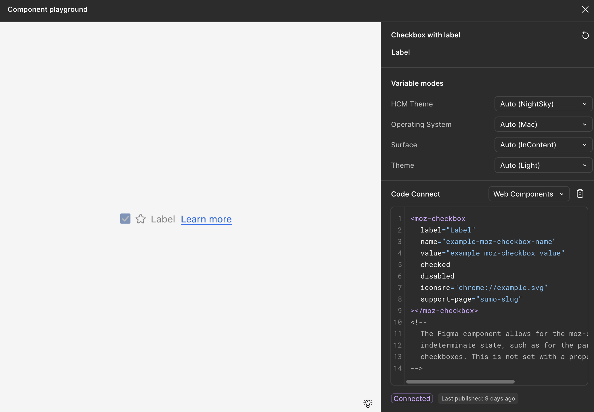
You can test the code snippet by opening “Explore component behavior” under the “Component information” section.
If this generated snippet does not appear to be correct, you can undo the change on Figma by utilizing the following command when you are in the same directory as the config file you are working on:
npx figma connect unpublish
Afterwards, commit and submit the file via moz-phab as you would any other bug.
How to find the Code Connect snippet
If you are interacting with an instance of a Figma component and you are in Dev Mode, then you will be able to find a section called “Code Connect” in the “Inspect” sidebar. The code snippet for the instance will be within that section. Depending on the component, there may be additional comments at the bottom of the code snippet that explains what may be missing from the implementation of the Figma component compared to the Lit component.
This section is also available if you are interacting with one of the variants of the main Figma component.
If you are interacting with the main Figma component itself - the wrapper holding all the variants that may exist - then there will be a “Component information” section under the “Inspect” sidebar. Click on “Explore component behavior” to inspect the code snippet as you test changing the properties of the Figma component.
For more examples, you can check out Figma’s Code Connect documentation.
Code Connect issues/pitfalls/scenarios
Mapping Figma props back to Lit props
You may encounter cases where in Figma you can toggle some configuration of a component. For example, given the “Checkbox with label” component, we can toggle a description, a support link, and an icon. When activating the “Show description” and “Show support link” toggles, we get two new editable text fields, “Description” and “Support link”. To ensure the generated code snippet shows the correct value for these fields, we have to map a Figma boolean to return a string when the boolean is true:
props: {
  description: figma.boolean("Show description", {
    true: figma.string("Description"),
  }),
  supportPage: figma.boolean("Show support link", {
    true: "sumo-slug",
  }),
}
In the “Description” case, we use figma.string("Description") so that the generated snippet will show the current value in the “Description” text field.
We don’t do this for the “Support link” case though, since the way to get the correct generated support link element is by passing a SUMO slug to <moz-checkbox>.
Working with nested props and nested components
You’ll notice that the actual moz-checkbox config file has a relatively large props object with two additional props objects called labelProps and checkboxProps.
This is due to how the component is set up in Figma as the main component is a wrapper called “Checkbox with label”.
This component consists of two components, “Checkbox” and “Label”, so we’ll use these component names for our nested props:
props: {
  // labelProps is intentionally omitted for simplicity
  labelProps: figma.nestedProps("Label", ...),
  checkboxProps: figma.nestedProps("Checkbox", ...),
}
This allows us to take our previously defined “Checkbox” props and reference them through checkboxProps which will be required for the updated example template:
props: {
    // labelProps is intentionally omitted for simplicity
  labelProps: figma.nestedProps("Label", ...),
  checkboxProps: figma.nestedProps("Checkbox", {
    checked: figma.boolean("Checked"),
    disabled: figma.enum("State", { Disabled: true }),
  }),
}
Once we add these nested references to our example template, then changing these properties in Figma will cause the generated code snippet to be updated accordingly:
props: {
    // labelProps is intentionally omitted for simplicity
  labelProps: figma.nestedProps("Label", ...),
  checkboxProps: figma.nestedProps("Checkbox", {
    checked: figma.boolean("Checked"),
    disabled: figma.enum("State", { Disabled: true }),
  }),
  example: props => html`
  <moz-checkbox
    checked=${props.checkboxProps.checked}
    disabled=${props.checkboxProps.disabled}
></moz-checkbox>`
}
Don’t use conditional statements in the example template
The example template does not allow conditional statements. Any logic should be handled through the props object.
// In this component, an icon should only render if there is a label
// The following example is invalid
html`
<moz-component
  label=${props.label}
  iconsrc=${ props.label ? props.iconSrc : undefined }
></moz-component>
`
// Instead, set up the figma[type] statements like this
label: figma.string("Label"),
iconSrc: figma.boolean("Show label", {
  true: "chrome://example.svg",
  false: undefined,
}),
// Then create the example template as normal
html`
<moz-component
  label=${props.label}
  iconsrc=${props.iconSrc}
></moz-component>
`
Match the case of what is present in Figma
Ensure that the names of any components, nested components, and properties that you use in the Code Connect file matches the name used in the Figma file.
For example, if a Figma property is named sHoW dEsCrIpTiOn (not that anyone would do that), it will not map correctly if it is referred to as “Show description” in the config file.
What if something in Figma doesn’t map back to anything in the implemented component?
Sometimes that’s okay! Some props will not map back to code and may be there to make using Figma easier. For example, many of the options under the “State” select for a component do not get mapped to code. Using the “Checkbox with label” Figma component as an example again, there are various options for State:
Default
Hover
Active
Focus
Disabled
There’s nothing we have to pass to <moz-checkbox> for it to appear in a “Default” state, so we do not need to map this.
“Hover”, “Active”, and “Focus” are all CSS pseudo-classes that are handled by the code implementation, we don’t have to pass any additional props for these states to behave as expected.
This leaves us with “Disabled” which is something that can be controlled through a property/attribute, therefore we want to make sure this attribute appears in the generated snippet when a Figma user selects “Disabled” in the dropdown.
props: {
  disabled: figma.enum("State", { Disabled: true }),
}
Other times, this could be a sign that there’s a deviation in the design or the implemented component. Maybe it’s a feature that hasn’t been implemented yet, and so we don’t want to show any code snippets when that feature is enabled in Figma. It could be something that was missed when previously creating the Code Connect config for a particular component, there could be a variety of reasons. It may be worth reaching out to design to make sure the implemented component and the design component are not deviating from each other.
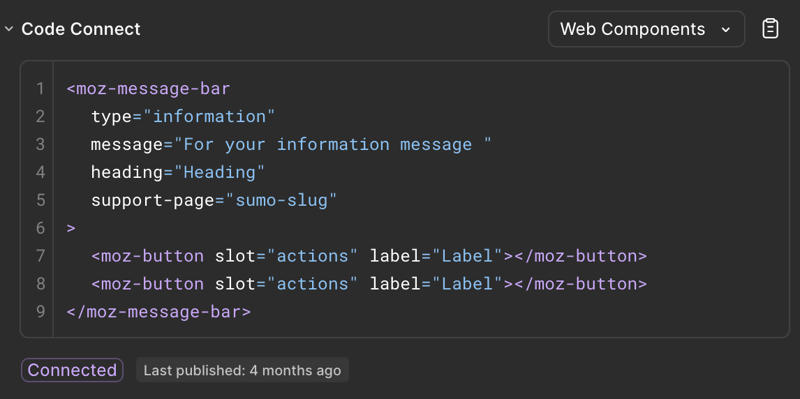
An example of a disrepancy between the Lit and Figma components
The following are properties of the moz-message-bar component as noted in toolkit/content/widgets/moz-message-bar.mjs.
/**
 * @property {string} type - The type of the displayed message.
 * @property {string} heading - The heading of the message.
 * @property {string} message - The message text.
 * @property {boolean} dismissable - Whether or not the element is dismissable.
 * @property {string} messageL10nId - l10n ID for the message.
 * @property {string} messageL10nArgs - Any args needed for the message l10n ID.
 */
In Storybook, we are able to change the message, heading, and action button label through the Fluent tab.
This mostly maps to the properties in the Figma component, however, we can only update the action button label through the nested Button component.
Additionally, we generally do not include l10n properties in the Code Connect example snippets.
As the nested Button’s properties are not currently exposed on the top level of the component, we are not able to reflect any changes to the Button in the Message Bar’s example snippet.
Below, the moz-button code has been hard-coded.